
Behind the Cover
It isn't just a pretty face.

Last time we chatted, I spoke a bit about the poetry that you’ll within The Blackbird Ballad. The forms that I chose, and why. This time, I want to focus on the wonderful cover designed by Emily Coffman.
While Emily absolutely knocked it out of the park, I do have to give credit where it is due and admit that the original design was given to me by someone else. A long time ago (late 2023), in a far away land (Calumet City, Illinois), there was a seven year old boy who was the first believer in this book. (He’s still there. He’s just ten now.)
That year, I spent Thanksgiving weekend in Cal City with the family to which this little boy belonged. Jack and I were early risers, so while Mom and Dad were still asleep, we spent the morning with our books and papers. I had finished my handwritten first draft, and was typing it up to begin the revisions process. Jack got curious about it, and left his own books to see what I was doing. I explained that I was writing the story, and even discussed poetry a bit with him because he noticed that the words weren’t in the prose paragraphs he was used to seeing. He asked a bit about the story. After I gave a bit of summary, I took the opportunity to read him a section, near the end with a wolf fight. You see, I wanted to test whether I had successfully written a poetic story to interest a child. As I told of one of the heroes trading blows with a massive black wolf, Jack was leaping about the room swinging an imaginary sword. I really couldn’t have been more pleased.
I quickly finished the section and settled him down again before we woke the parents. Jack decided to write a poem himself before the difficulty of rhyming made him set it aside, although he made a good go of it. I was about to encourage him to keep trying, but he suddenly got a bright look on his face.
“Are you going to sell the book?” he asked.
I explained that I hoped to publish it one day, but there was a lot of work to be done before I could make that happen. Almost before I finished my explanation, he raced to his bedroom and emerged with paper and crayons.
He settled at the coffee table beside me and began to draw. After he was done, he turned to give it to me, pointing out the river, the forest, and the raven. I hadn’t mentioned stars in my summary, but he had used purple and blue—nighttime colors—and thought they were appropriate. I honestly had to agree.
I treasured this little six inch square he gave me. And I promised that I would use it as a basis for the cover if ever I managed to find a publisher.
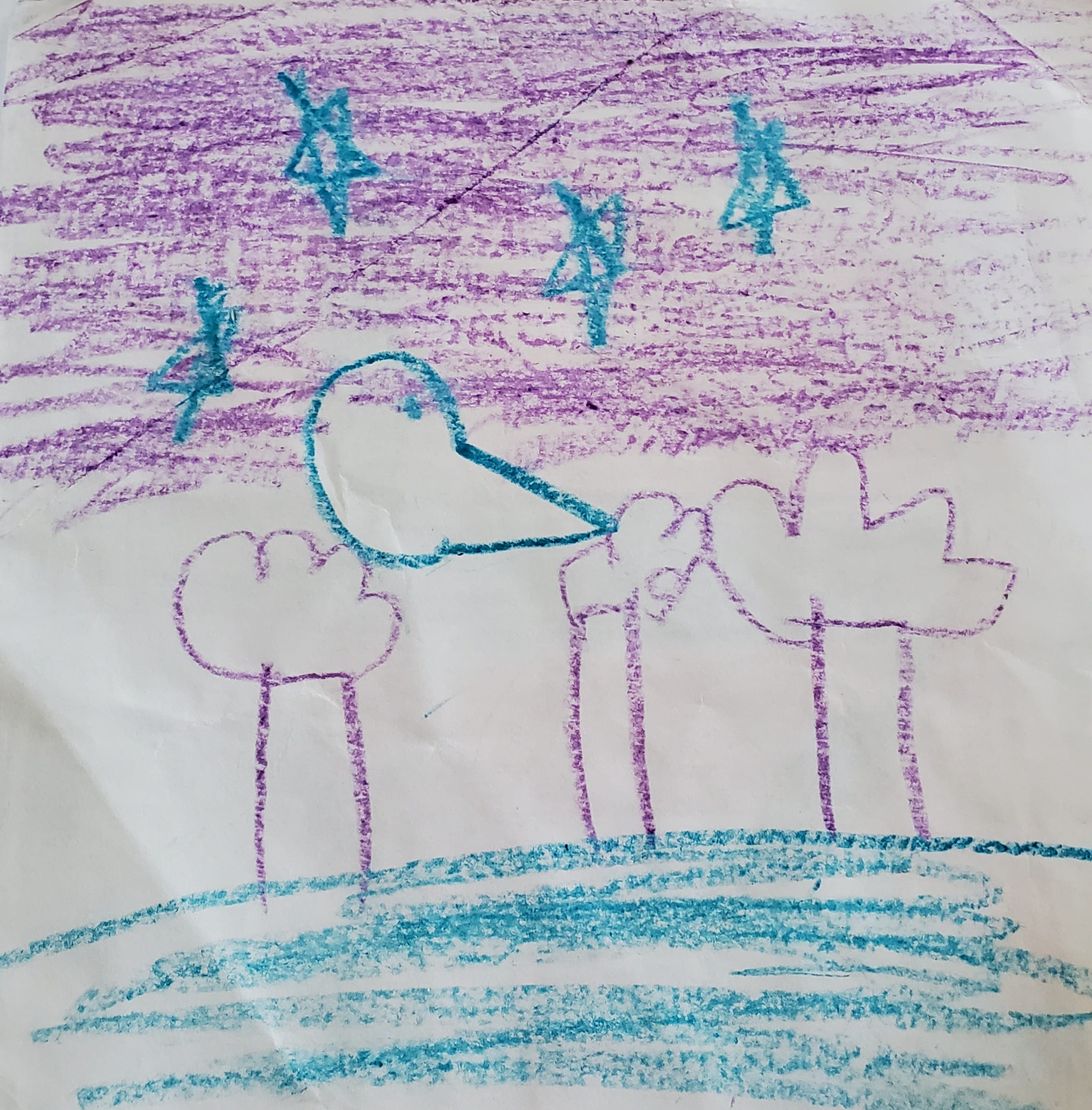
A few years later, I had worked through many revised drafts of the poem, and was beginning to think about sending it out to publishers I had become familiar with. (Over that time, when I made periodic visits, Jack would inquire after progress with the book, and check on my promise to use his cover design.) I knew that I wanted illustrations with the poem as well, and so I turned my mind to finding an illustrator. I began a book club and reconnected with an artist friend who did some amazing linocut work. I had some of her pieces on my wall, and her style matched what I envisioned. So I asked Emily to coffee before book club one night to pitch working with me to create a set of illustrations and design the cover.
I think I was less nervous the first time I asked someone on a date.
Fortunately, I had greater success than that request for a date. Emily said yes, and we began to work on creating the design and feel of the book. (I’ll be posting an interview with her later to go over her work and methods!) I sent her a copy of Jack’s drawing, and asked if she could use that as the basis when she began the cover work.
She added a second raven to indicate the two characters in the story, but kept Jack’s placements and nighttime theme. I particularly loved the detail with the stars that nod to Vincent Van Gogh, an artist that we both really love.
I took a copy with me on one visit to see Jack and his family, to show him and get his approval, as well as to let him know that I had selected a publisher and sent the manuscript to see if they would accept it. He gave the image a good long look before giving his agreement that it was a good cover.
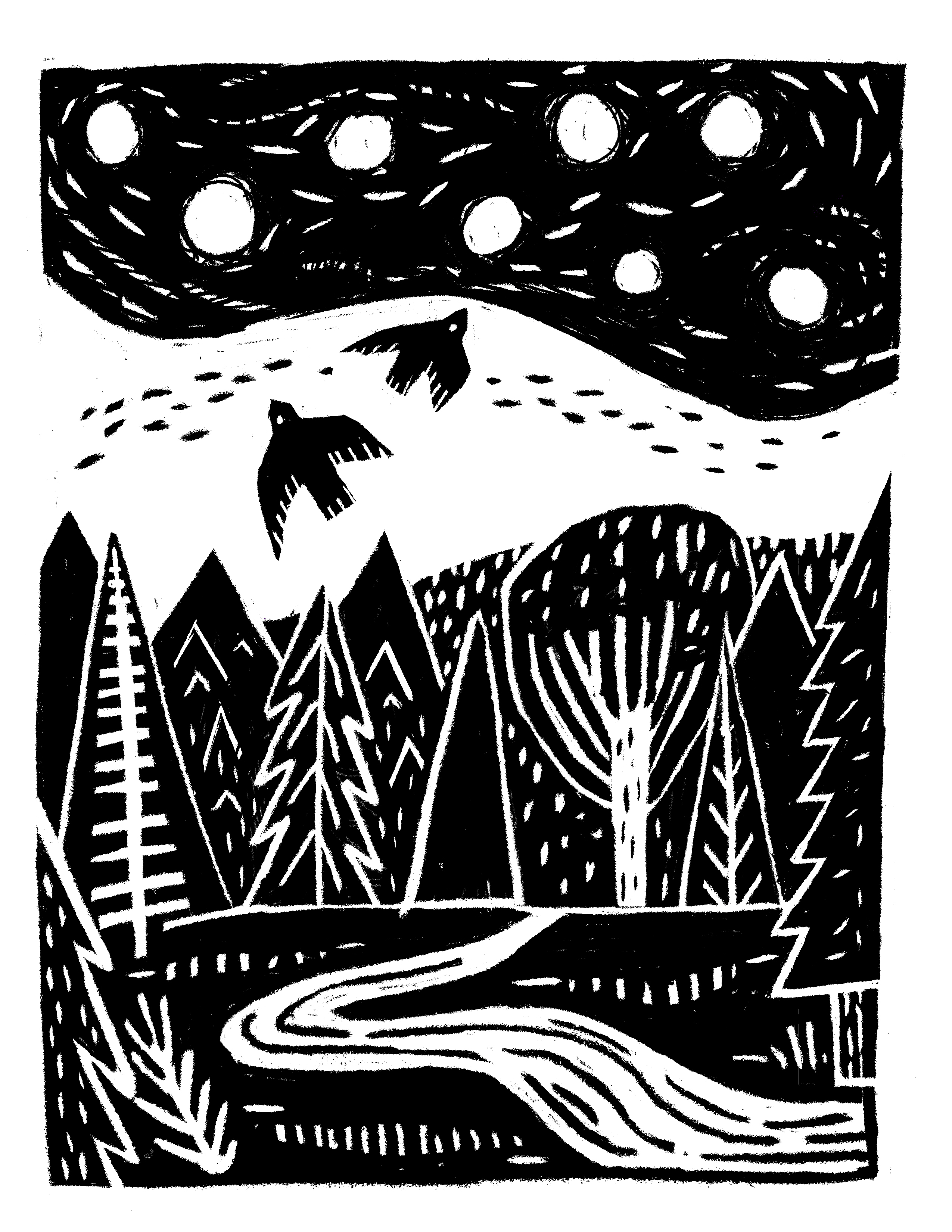
There was one more step to complete. After Solum notified us that The Ballad had been accepted for publishing, we started discussing color for the cover. While the black and white was beautiful, we knew that we wanted something a little less stark for a children’s book. We waffled a bit on the color scheme to use. I wanted to match it somewhat to the colors Jack had chosen for his original drawing. The presence of stars also indicated a nighttime scene, but I didn’t want it to be too dark or monochromatic.
Eventually, we decided to lean into the blue a bit and add orange. My favorite time of day is that short span at the end of sunset, when the world and the sky are mostly darkened, divided by a bright line of orange and pink. It is the most beautiful shade of orange, and I felt that twilight, a time of in-between, was a great symbolic pointer to the in-between of the Road through Faerieland.
Only the font remained, which Emily also designed. We spent several hours pouring over books, old and new, to create something both traditional and inspired by old fairy tale books, but would fit with the illustrated style. They feel like carved letters. Bold and simple, and giving a sense of endurance.
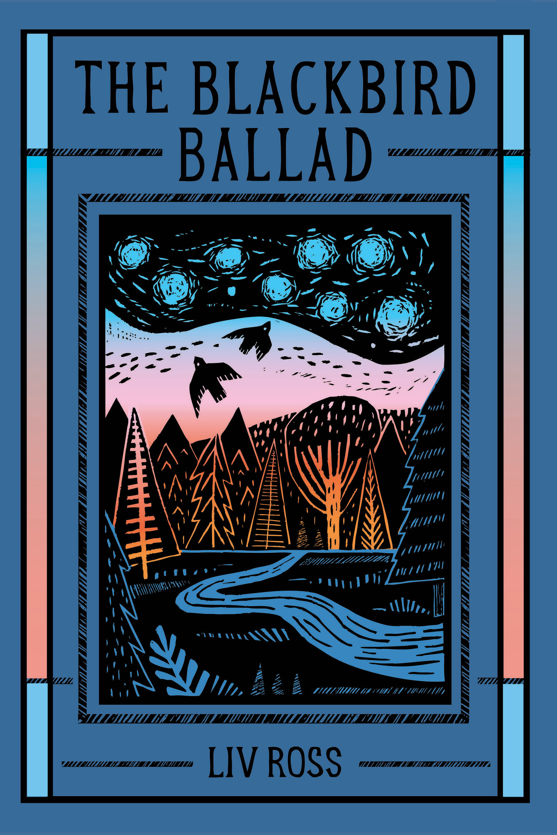
Sarah Christolini, Solum’s graphic designer, worked with us in the final stretch of the cover design. She added the gradient bars running parallel up the sides to the front and back of the cover to add further visual interest, and tie front and back into a cohesive whole.
I am extraordinarily grateful to all three of these artists, Jack, Emily, and Sarah, for helping dress the book up in a cover that is far, far better than anything I could have imagined on my own. While writing is often a solitary act, the creation of a book is far from it. For this one, I was really blessed with some of the best partners God could have provided.
Sláinte
Now, here is the part where I admit that getting a publishing contract and pre-order links going live do not mean that the work is over. People do not become spontaneously aware of new books, and this is why I’m telling you about mine. I am also asking that you help me further get the word out. The pre-ordering period is a very important time for a new book coming out. The algorithm is deeply unhelpful, but word of mouth is so precious. All of my favorite authors and artists were those recommended to me from someone I knew.
Likes are helpful, but even more so, I’d love it if you could share. Share these posts talking about The Blackbird Ballad, or share the order link with friends you think would enjoy it.
Pre-order links:
I am very aware that purchasing a book before it is even available is a mighty vote of confidence in our work. As a thank you, I have worked with Emily Coffman to create a limited run of original prints. These 5x7 prints are hand carved linocut originals based on one of the illustrations from the Ballad. When you complete your pre-order, fill out the linked Google form, here. We will be mailing these out when the book releases on May 24th!
*Work on The Abbey of Curiosity will always remain free. I do, however, have a taste for high quality paper and pens with which to draft my poems, so if you have found pleasure in my writings, you can donate to the paper and pen fund through Buy Me A Coffee. Kind words are also appreciated to bolster my delicate poet’s ego. :)
The aesthetics are SO satisfying, Liv. This is my favorite kind of cover! Lovely to hear the back story.
Pre-ordered on Amazon and submitted linocut request. This is a beautiful cover and I have no doubt the verse within is as well. Best success!